In November 2019 we decided to become a technological partner and co-founder of the KPet project. The challenge was to build an ecosystem totally pet care-related. Find out how we helped them to grow from branding to publication on the stores.
It became clear that the project had to be divided in two different applications for maintenance and updating reasons. KPet and KPet business applications were therefore created from a common codebase and managed thanks to continuos integration practices.
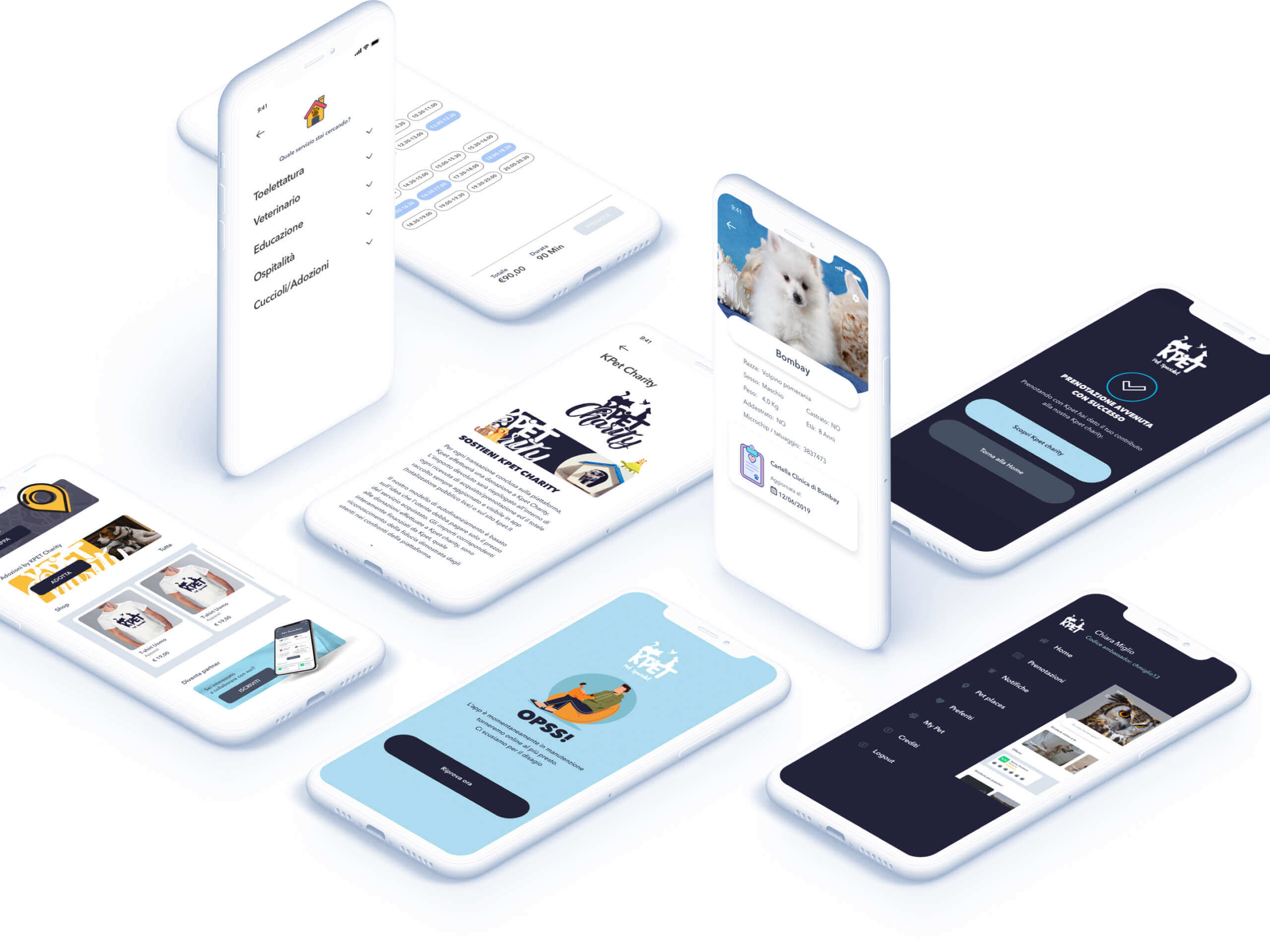
User App
+150
Available services
+4.200
Registred pets
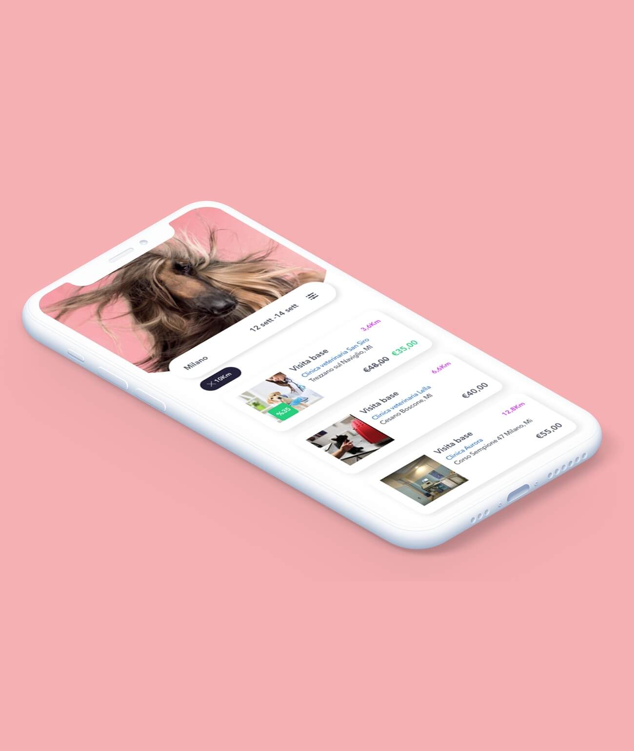
Usability and design were our main focus when we developed the client app. The main challenge was the creation of a search system that combined heterogeneous services in a single pattern in order not to confuse the user. After the first release we sent out a survey to the users in order to evolve and progress based on their feedback, needs and wants.
Pet tab
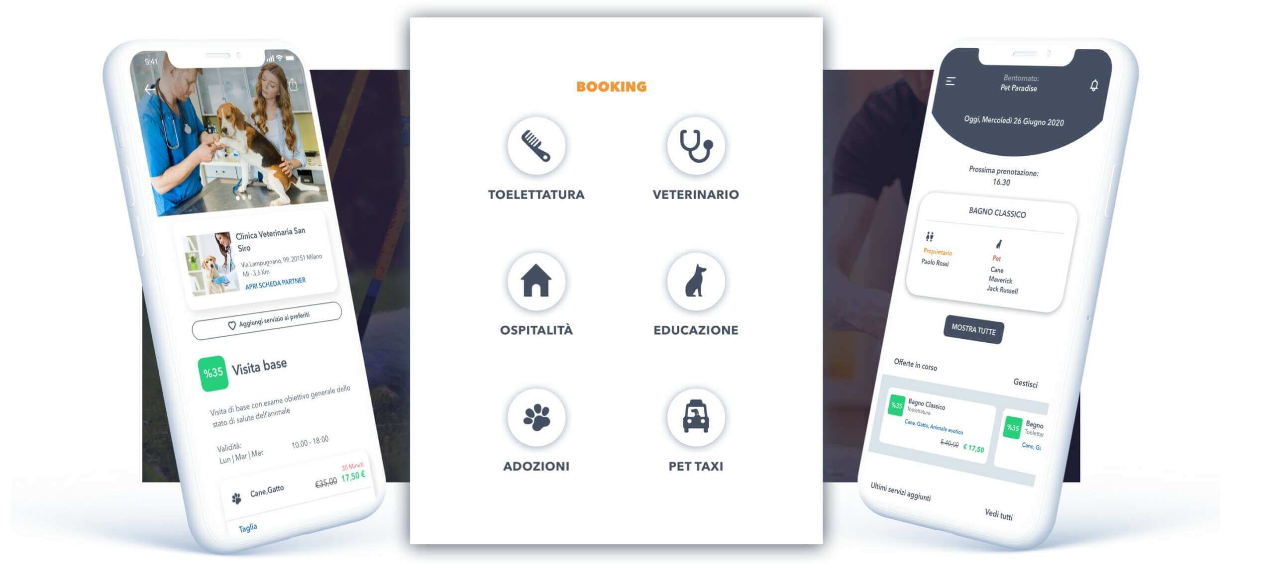
Pets are central to the project. We created a pet card that serves as a virtual box for the pet’s data. The pet card features information ranging from clinical analyzes to prizes collected by the pet, so that it is available at any time.
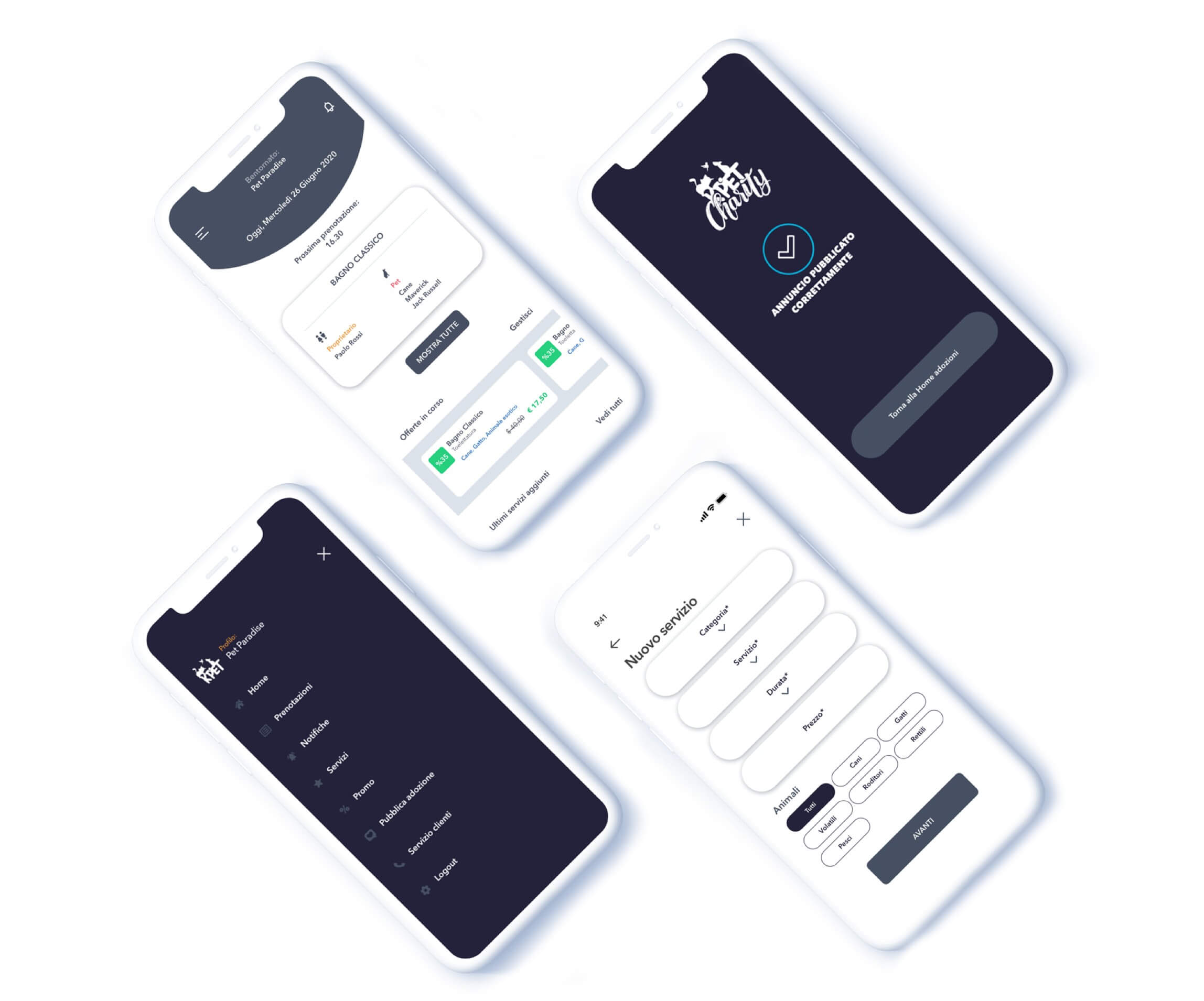
App partner
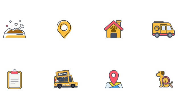
Thanks to the KPet Business component, partners can manage and receive bookings for their services. They can acquire visibility by publishing offers and by being displayed on a filterable and geolocalized map.
KPET Charity
A key step of the project was the creation of a section entirely dedicated to KPet Charity. This section features the map of pet-frendly places and the list of animals to be adopted. This section is constantly evolving and updating. On the official website information can be found at any time https://kpet.it/charity
Pet places
Interactive map of all pet-friendly places. Here you can search and find your next hotels and restaurants without having to stress about the puppy, it will always be welcome!
Food program
Part of the proceeds of KPet is donated to the food program. Animal associations can receive continuous contribution for food and equipment. Thanks to KPet, users can also help with the rescue and protection of puppies looking for a home.
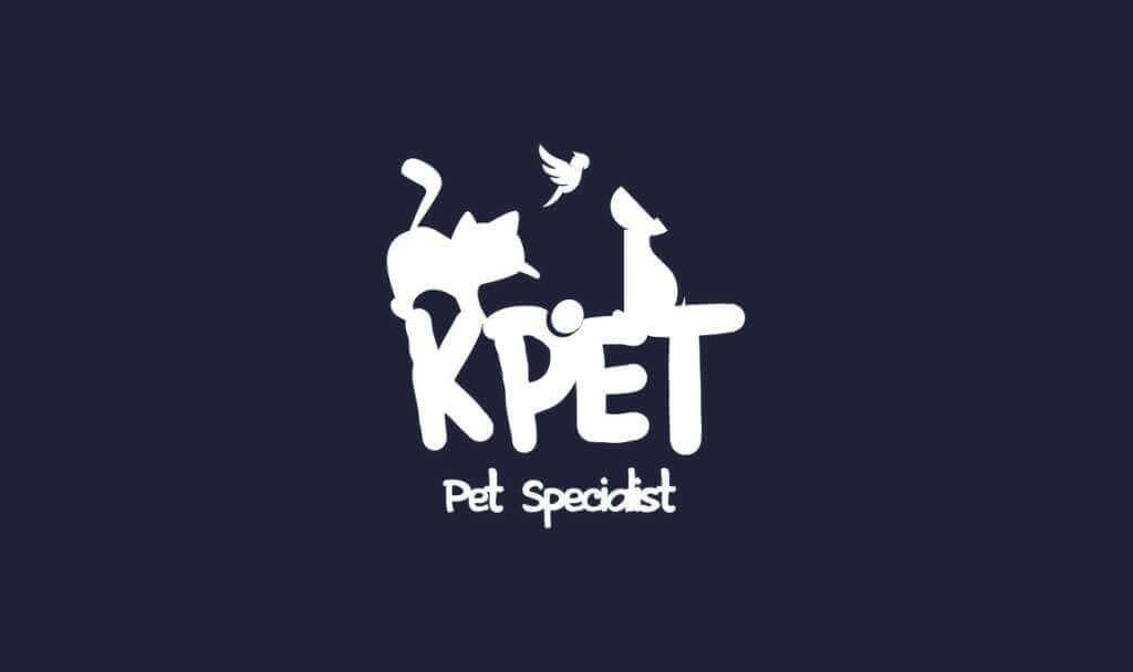
Logo design & branding
Being completely new in the sector. The logo and logotype had to communicate and identify the company’s values quickly and clearly, embracing the pet world without focusing on a single sector. The 1: 1 aspect ratio allows high recognition even at small sizes.
The concept of universality is underlined by the choice of using a wide palette of colors as “secondary colors” to support the KPET Blue.
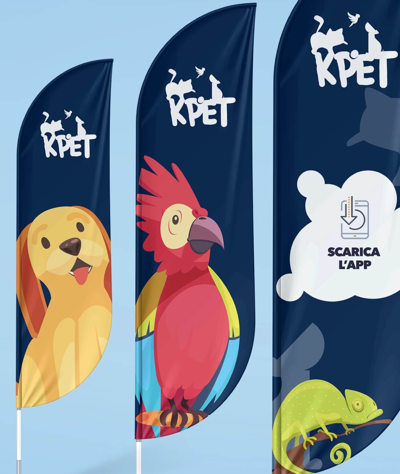
The whole project featured an impressive design of gadgets, stickers, merchandise, flags and 3D installations.
Social media
Oltre 600
Post
+120.000
Follower
Through animated videos, illustrations and a set of carefully-picked images we gave life to the Facebook and Instagram pages. We used the conversions and posts in the “KPET Friends” group as a driver to optimize the contents of the conversion campaigns and storytelling activities, so to enrich the experience of the page in return. The result? Over 120,000 followers in 6 months. JOIN THE REVOLUTION
We use cookies on our website to give you the most relevant experience by remembering your preferences and repeat visits. By clicking “Accept”, you consent to the use of ALL the cookies.
This website uses cookies to improve your experience while you navigate through the website. Out of these cookies, the cookies that are categorized as necessary are stored on your browser as they are essential for the working of basic functionalities of the website. We also use third-party cookies that help us analyze and understand how you use this website. These cookies will be stored in your browser only with your consent. You also have the option to opt-out of these cookies. But opting out of some of these cookies may have an effect on your browsing experience.
Necessary cookies are absolutely essential for the website to function properly. This category only includes cookies that ensures basic functionalities and security features of the website. These cookies do not store any personal information.
Any cookies that may not be particularly necessary for the website to function and is used specifically to collect user personal data via analytics, ads, other embedded contents are termed as non-necessary cookies. It is mandatory to procure user consent prior to running these cookies on your website.